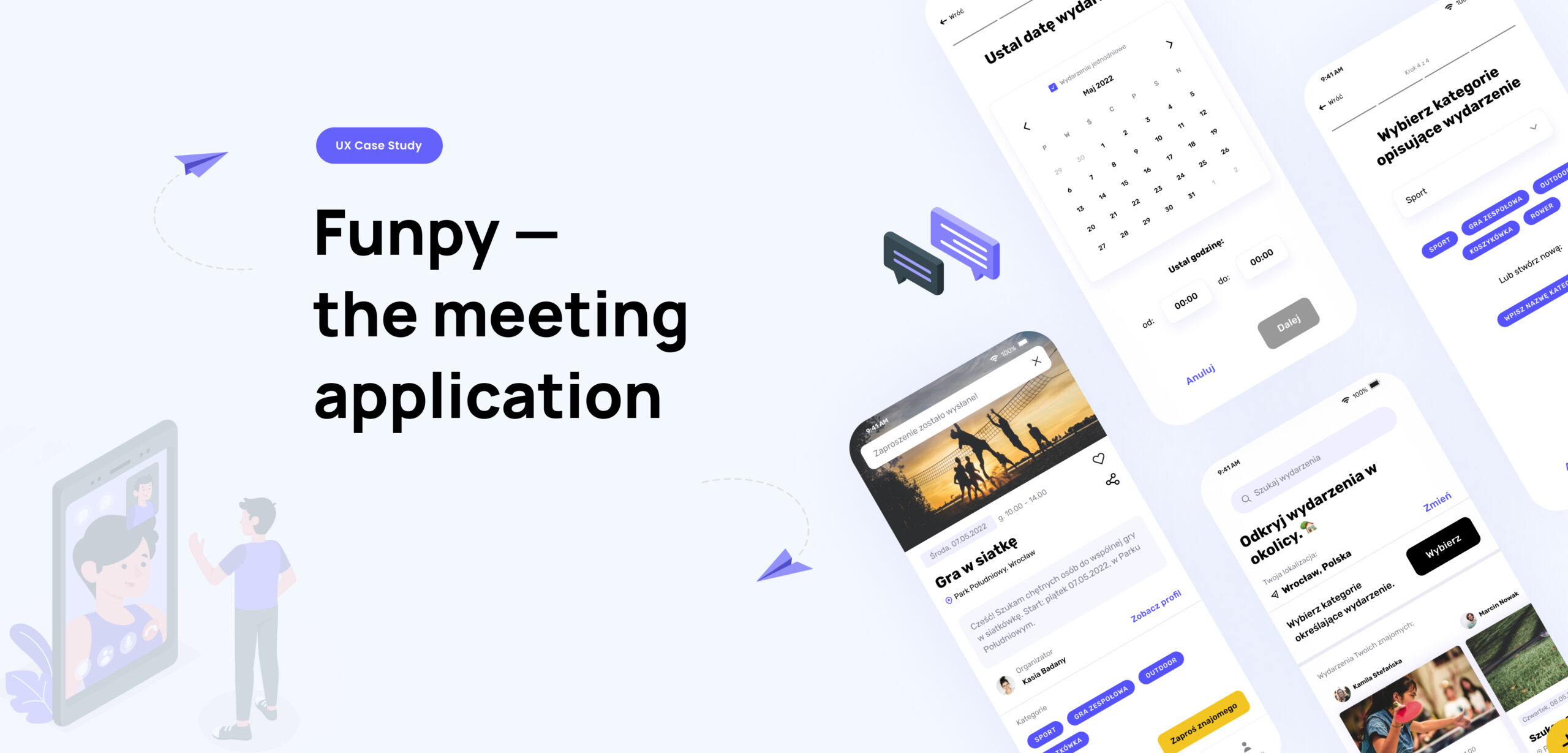
UX DESIGN
Being a part of a UX/UI course we wanted to create an app that would respond to the needs of a specific group of users. We wondered what could be a problem of the most numerous group of digital product users - The Generation Z. We've been working in a group of 3, each of us contributed equally to the design process.
Being a part of a UX/UI course we wanted to create an app that would respond to the needs of a specific group of users. We wondered what could be a problem of the most numerous group of digital product users - The Generation Z. We've been working in a group of 3, each of us contributed equally to the design process.
Research
User interviews
Ideation
Modeling
Design
Usability testing
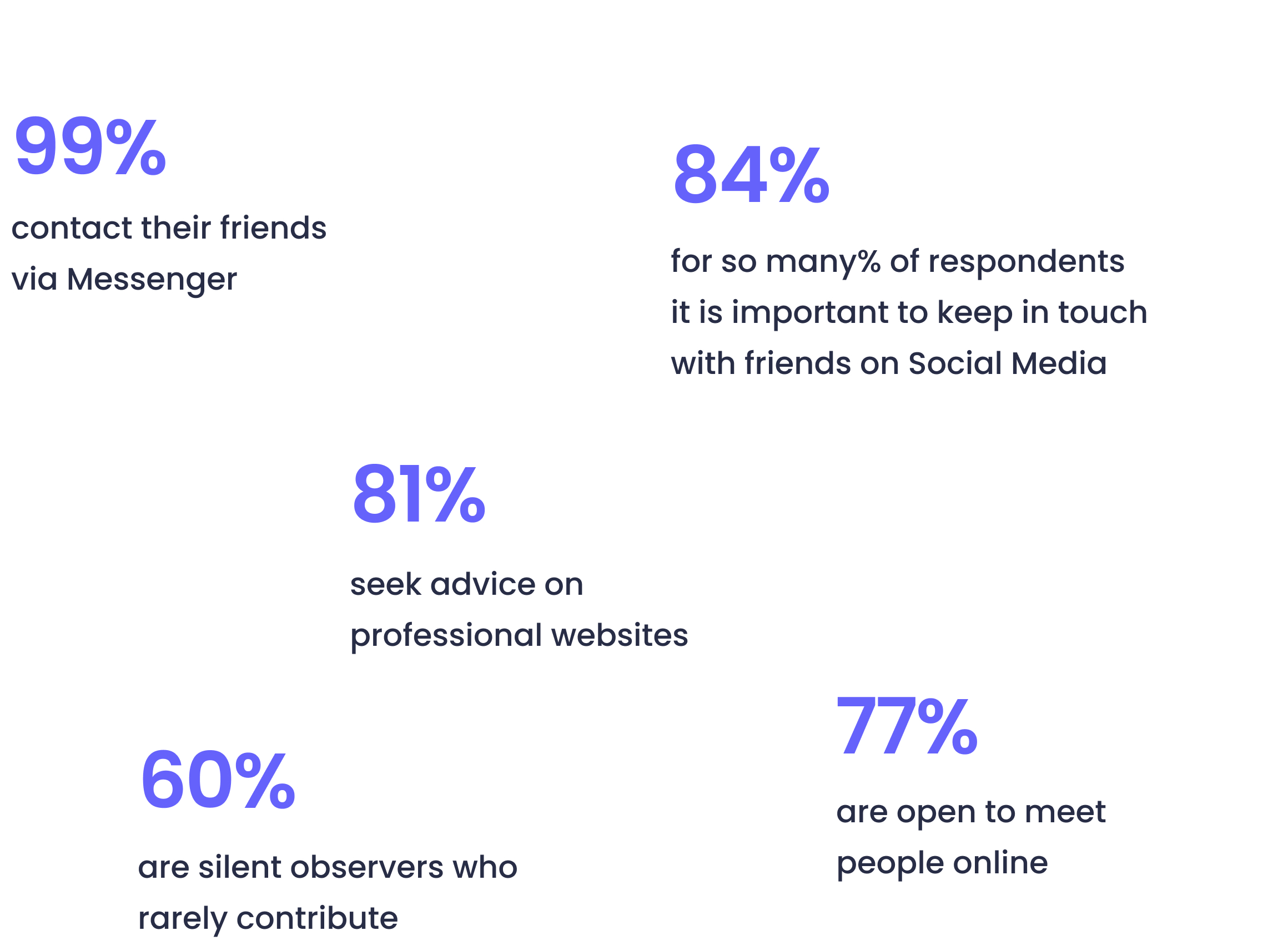
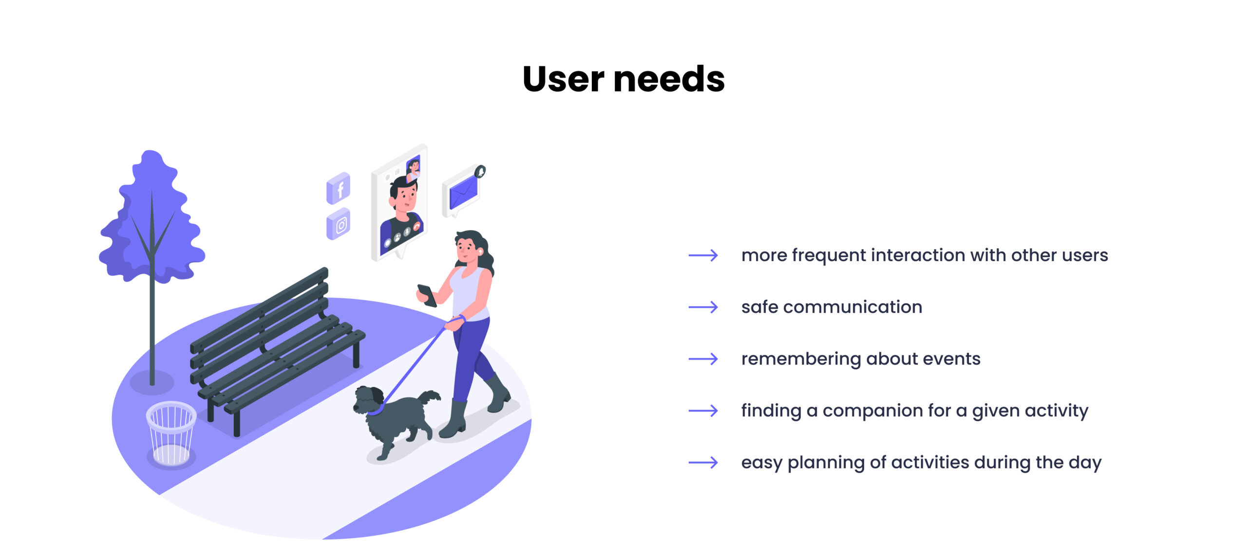
Hypothesis: many of young people may have problem with finding company for various online and offline activities.
For 82%* of young people the most important thing while using Social Media apps is keeping in touch with friends. Given the recent years of social isolation in the Coronavirus pandemic, we've decided to explore the topic and create a social app for online and offline meetings.
* Results of our quantitative research.
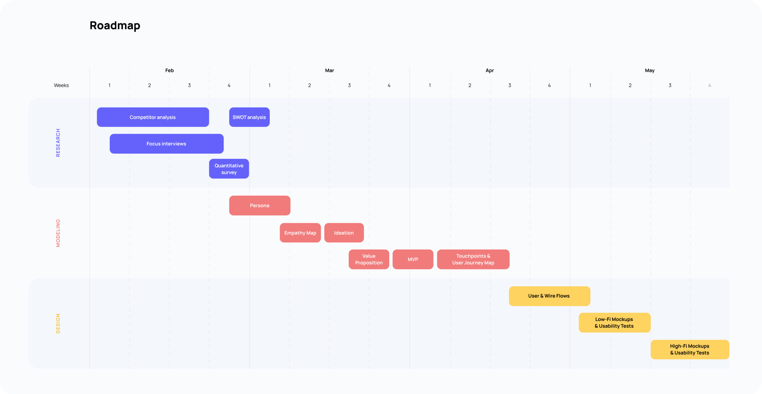
Research
To learn about the characteristics of our target group, we've searched the latest reports on Generation Z - to learn about their functioning in the digital world, their habits and values. In order to deepen this knowledge and build an image of our persona, we chose the method of focus interviews on a group of 6 people recruited using screener questions. We asked our participants:
How do they plan their social life?
How do they function on Social Media?
What do they feel about it?
In addition, we conducted a quantitative survey on a group of 148 people, which helped us a lot to verify the knowledge gathered in the interviews, for example about the applications they use to organize meetings with friends.
Documentation:
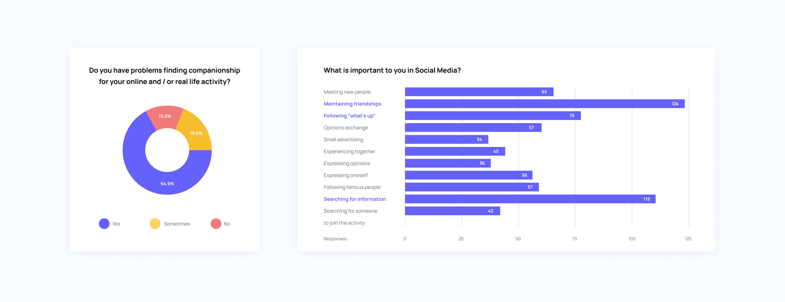
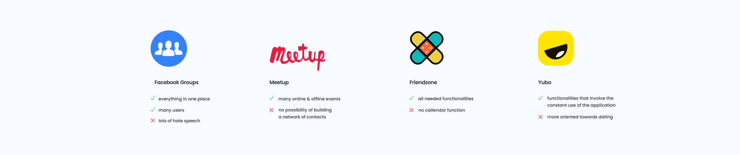
From the surveys and interviews it turned out that our biggest direct competition are groups on Facebook. Their advantage is the concentration of many useful functions in one place, which often appeared as a product advantage in the respondents' answers. The respondents use them to find a companion for walks with the dog, broaden their interests, and, of course, to contact their friends.
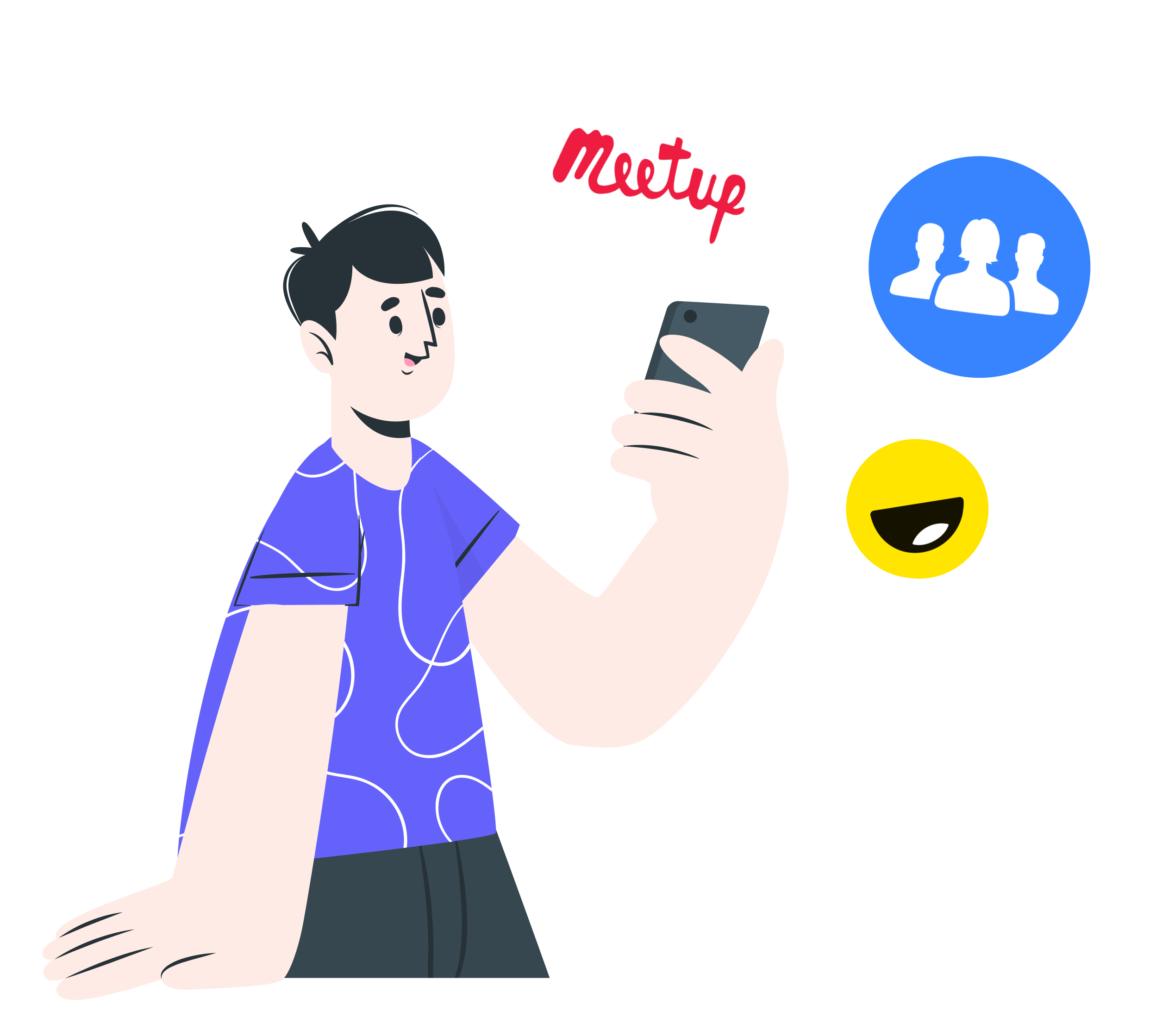
Sifting the internet, we managed to find examples of indirect competition, such as MeetUp - an application for creating events, but only thematic, or Yubo - for meeting friends, but also with a dating function - which discourages half of the respondents from using it.
This gave us food for thought - we won't duplicate these unsuccessful functionalities, and will try to smuggle those that work well for our competitors and are most appreciated by the respondents - the SWOT analysis helped us in this.
Documentation:
Modeling
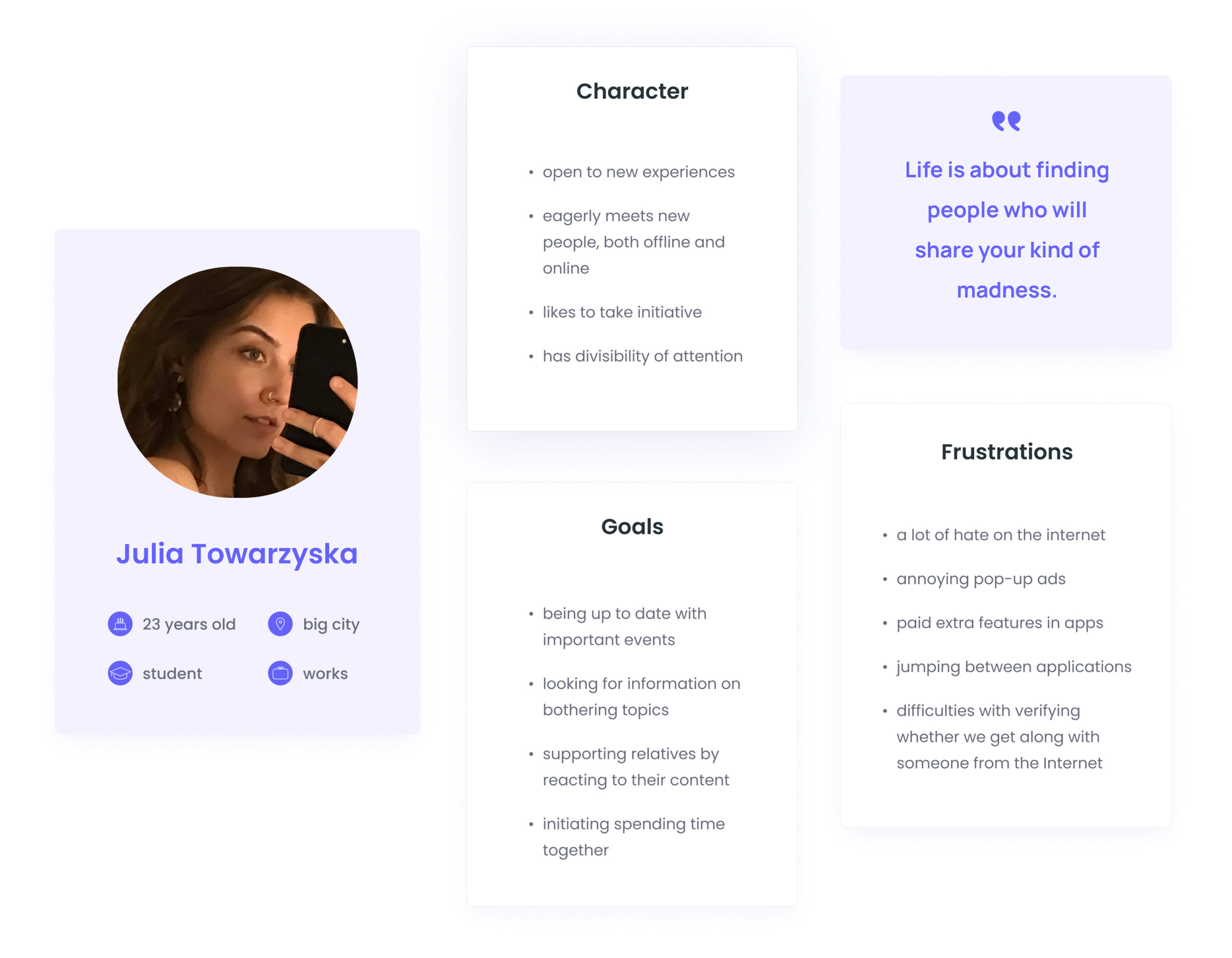
Thanks to the analysis of the collected responses (first individual, then cluster), a very homogeneous image of the Persona - Julia Towarzyska - has emerged. As the vast majority of responses were consistent, this gave us confidence in the needs and frustrations of future users.
Creating an Empathy map based on a cluster analysis was a big step forward for our team in imagining users' needs. It was the first "to be or not to be" moment for the future functionalities and it helped us to be more consistent as a team in our decissions as well. We could finally start thinking about who to address our product to and what specific functions it needs to have.
Documentation:
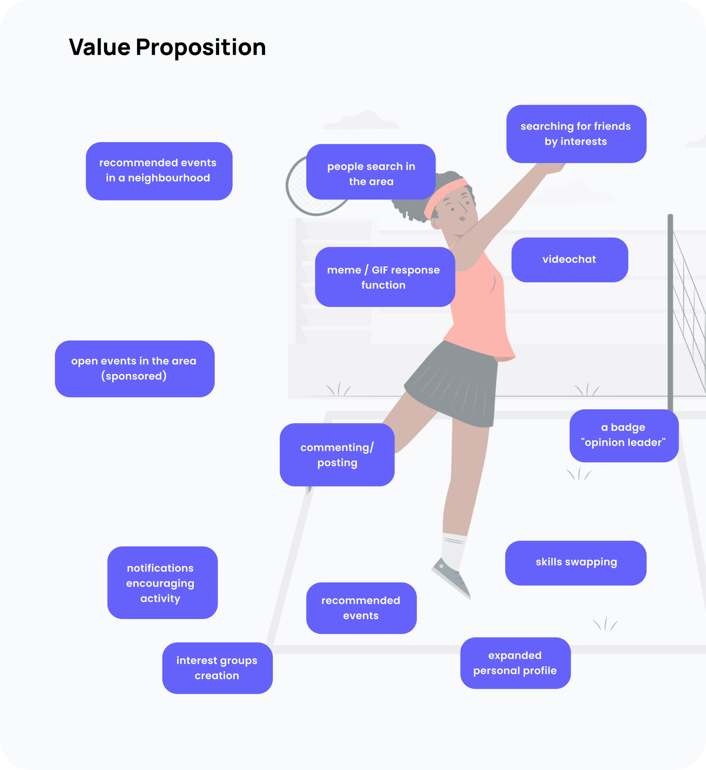
When speaking of functionalities, in order to squeeze the maximum of ideas out of our heads, we used the workshop method of generating them, the so-called 3-5-6 method. We have divided these several dozen ideas into three categories of Walt Disney's concept - realist, dreamer and critic. Most of them turned out to be realistic to implement, so we had a considerable challenge to do the selection and identify which ones are crucial to the foundation of the product. The next two stages of the process helped us in this.
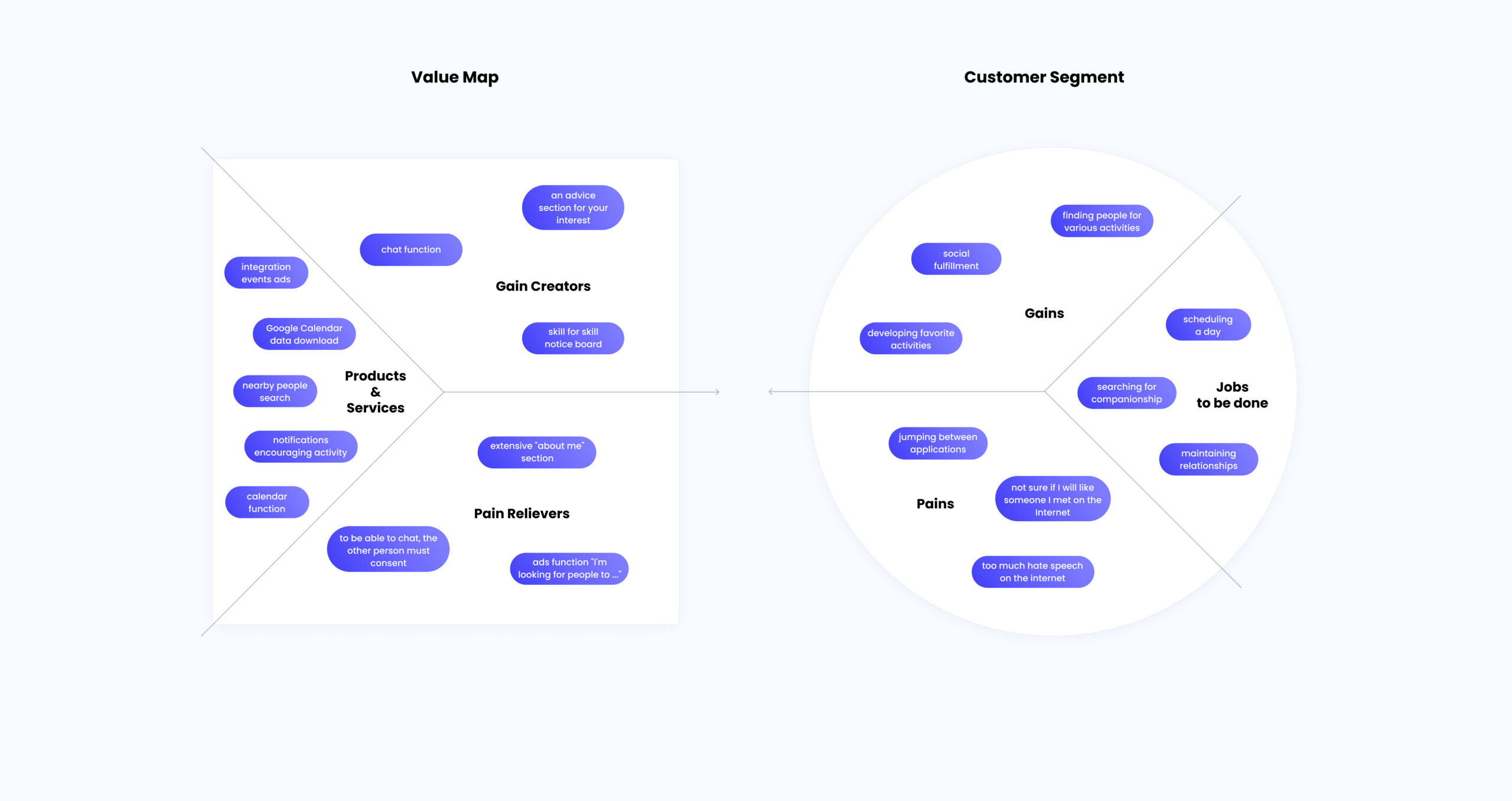
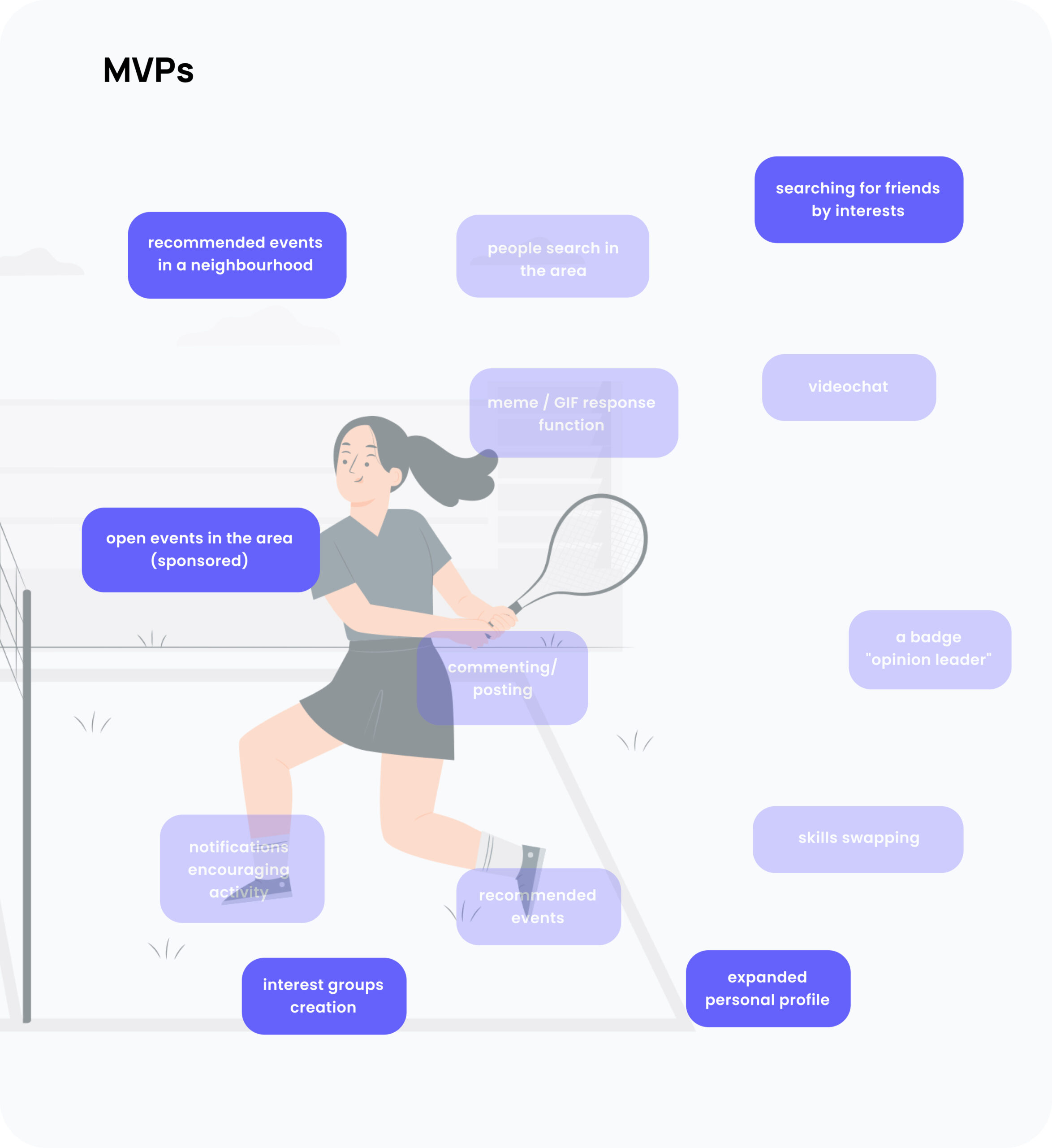
Working on Value Proposition Canvas (using the Circle and Square method), we wanted to draw the expectations of our persona, potential obstacles and benefits in achieving its goal. We wanted to find ways to handle it all. At the same time, it was probably the most difficult moment for our team - this stage required total concentration and the ability to apply the knowledge about users that we acquired thanks to interviews and a Map of empathy. This was a foundation for our business plan. We wanted as many elements from the square as possible to match those from the circle. At Products & Services, we developed a lot of ideas for functionality, so the next necessary step was Red Routes – to establish our MVP.
Documentation:
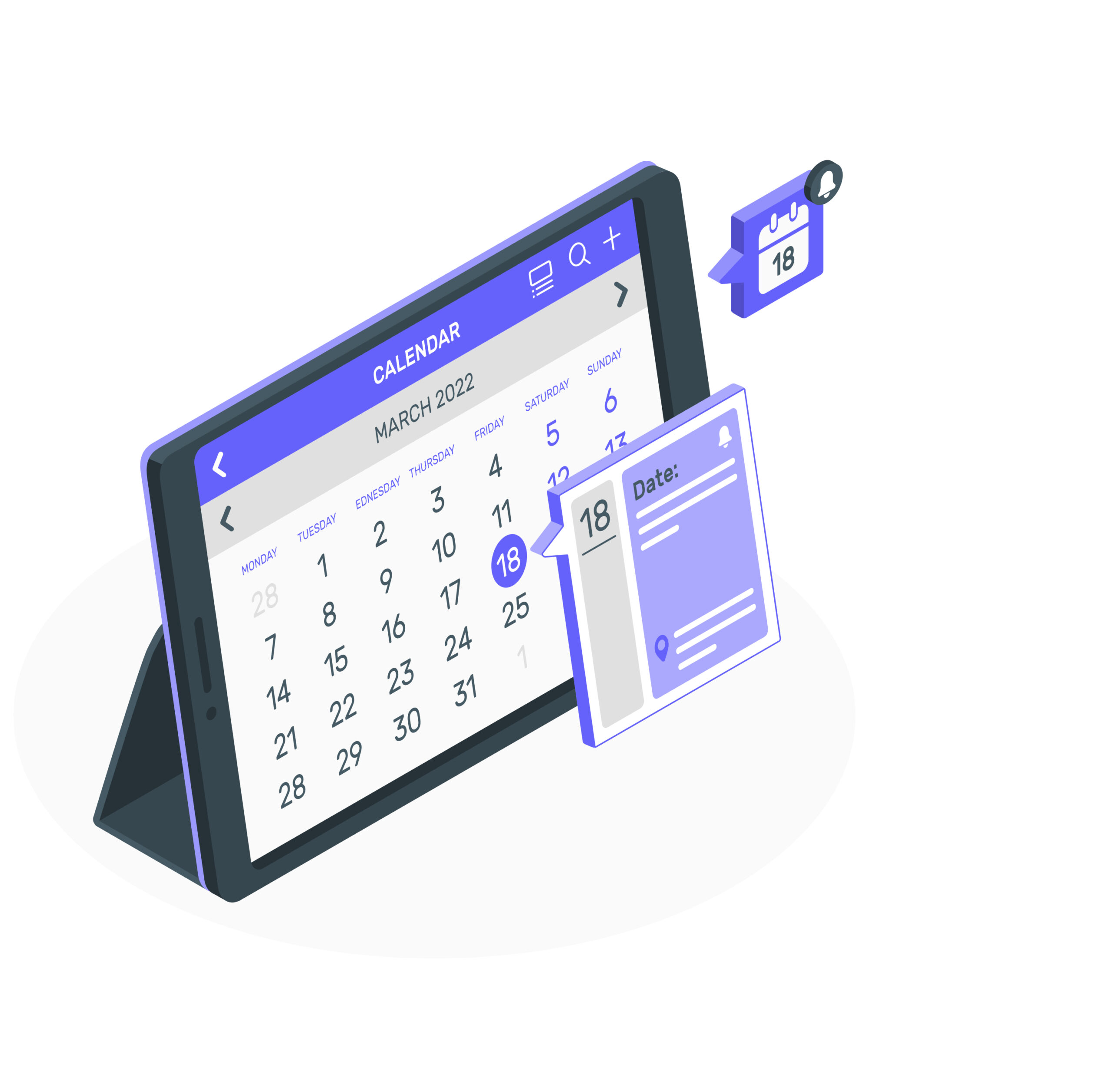
The business model of our product started to take a blush. When analyzing Red Routes, we started to see a light in the tunnel, it was easier for us to imagine our application. The product had a formed, logical basis. We have learned from the interviews that many people want to organize their day well, so one of our MVPs was the built-in calendar function, which would be available in the Premium version. So we already had an idea of monetization of the product. In addition, of course, the basic functionality would be the option to create events and their recommendations, based on chosen interests.
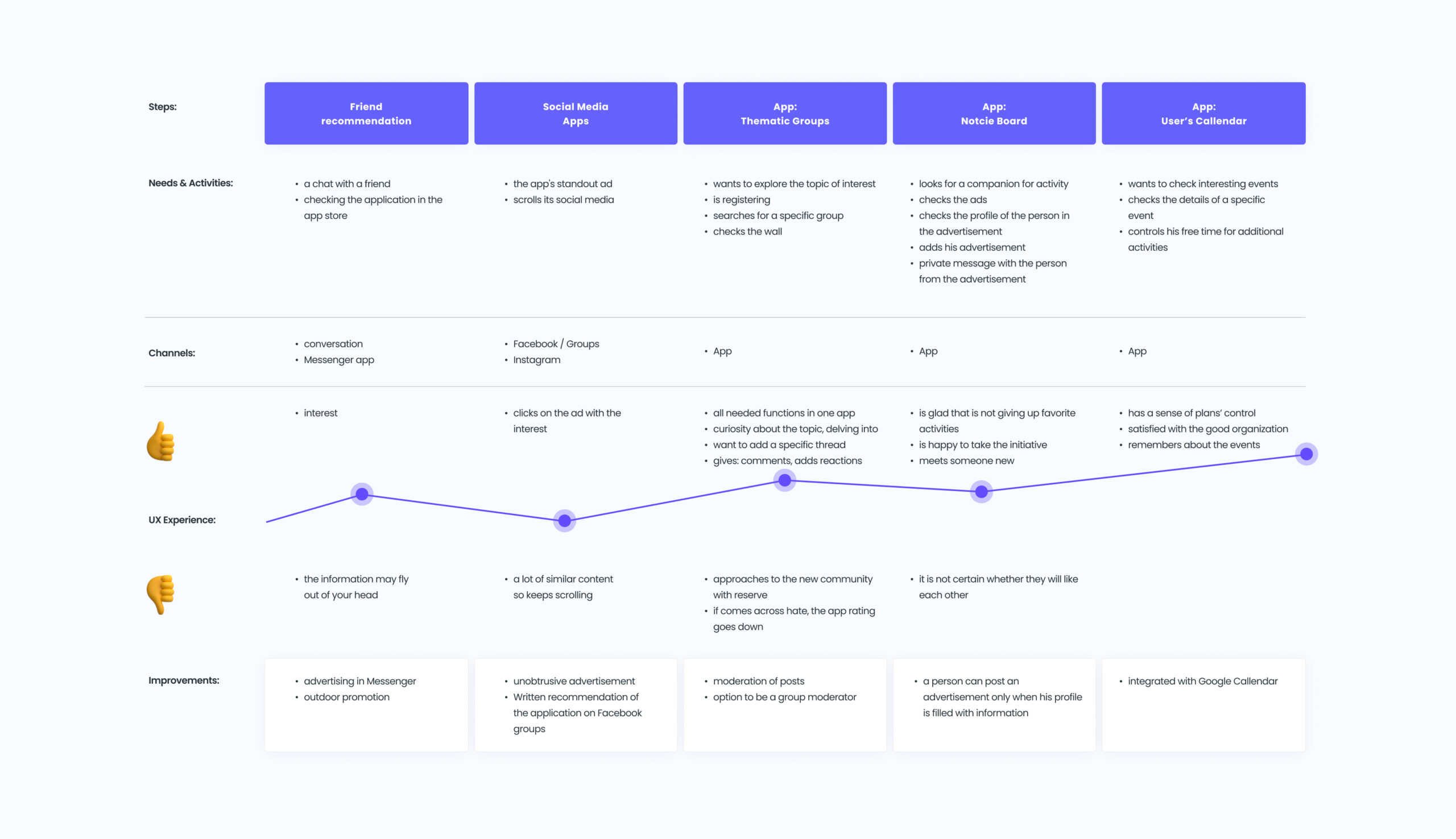
By specifying Touchpoints, we created the User Journey Map. It was important for us to pay attention to the weak points of users' contact with the product, having in mind not only the persona, but also the entire generation of young people who are sensitive to hate speech on the Internet. Hate speech is one of the weaknesses of our strongest competition - Facebook groups. Therefore, we knew that this was a problem that we would like to focus on when creating the app.
Documentation:
Design
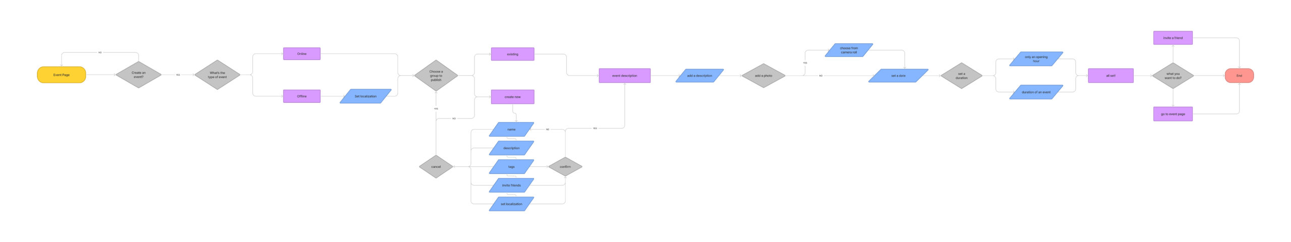
After careful thinking about how the application works, it's time to design User Flows. Our first attempts to understand were slow, but finally we caught on. It was up to me to design the process of creating an event. There was an important decision to make about how the event posts would be published - whether in Interest Groups or directly on the Home Page. Together, we opted for the second solution, wanting to check it in Usability Tests.
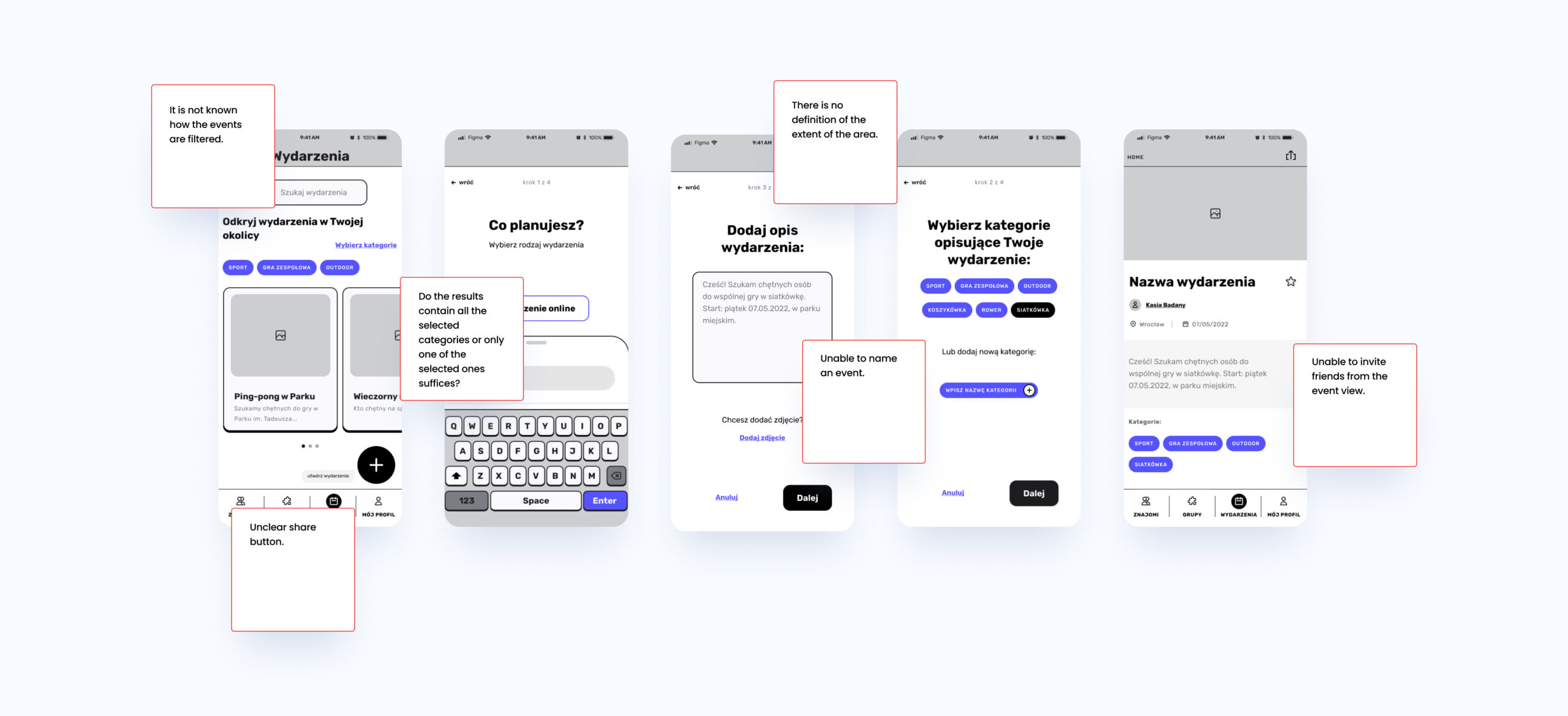
Shortly after, we turned to handdrawn Wire Flows. I must admit that it was an exercise in patience. When we had a Low-fidelity, clickable prototype ready, we put it through Usability Tests on a sample of 6 people. It made us humble because we forgot a few things that were important, for example: users didn't know how events were filtered on the home page, or… the function of naming an event was missing.
Documentation:
We have fixed errors and moved to the final stage - designing High-fidelity Prototypes. We had them also subjected to Usability Tests, and will implement these fixes and new functionalities as in subsequent iterations.
We have designed views in the MVP version at the moment and plan to develop the rest in the future.
Documentation:
Summary
When creating Funpy I learned about the idea of conducting interviews and research with users, new workshop methods that will be useful not only for other UX Projects, but in everyday work practice as well. I was able to see how crucial analytical thinking is for creating a digital product, not forgetting its users for a moment.
I would love to develop my skills in business matters to be able to design well, but also to be able to keep the product alive and enjoy its development.